Contrast is one of the fundamental visual tools that shape how viewers experience an artwork. In painting, design, photography, and sculpture, artists rely on contrast to create visual definition, rhythm, and focal emphasis. Without contrast, visual information becomes flat and indistinct, making it difficult for viewers to recognize hierarchy within a composition.
The concept appears across many creative fields, but its role in visual art is especially significant. By placing opposing elements side by side, artists strengthen perception and guide the viewer’s attention through the composition.
Contrast functions as a visual mechanism that transforms simple differences into meaningful artistic structure.
The definition of contrast in art refers to the intentional use of opposing visual elements in order to highlight differences and create emphasis within a composition. These differences may involve color, light, scale, texture, form, or spatial relationships.
When two elements differ clearly, the viewer’s eye immediately recognizes their separation. This visual tension becomes a practical tool for artistic communication. Artists use contrast to distinguish subjects from backgrounds, emphasize focal areas, and build dynamic visual movement.
The phrase what does compare and contrast mean is often associated with analytical writing, but in art it describes a visual process. Comparison reveals similarity, while contrast highlights difference. When both processes operate together, the viewer understands structure more clearly.
The definition of contrast in art centers on arranging visual differences to produce structure, emphasis, and viewer engagement.
Contrast is widely recognized as one of the essential principles of art contrast, a group of guidelines that organize visual elements into coherent compositions. These principles also include balance, rhythm, unity, movement, proportion, and emphasis.
Among these principles, contrast often activates the others. For example, emphasis becomes stronger when a subject contrasts with its surroundings. Rhythm becomes visible when alternating elements display measurable differences.
In visual design education and academic discussions within institutions such as Museum of Modern Art exhibitions or art theory publications in Frieze Magazine, contrast is often described as the principle that introduces energy into visual systems.
Within the principles of art, contrast organizes attention and strengthens visual hierarchy in artistic composition.
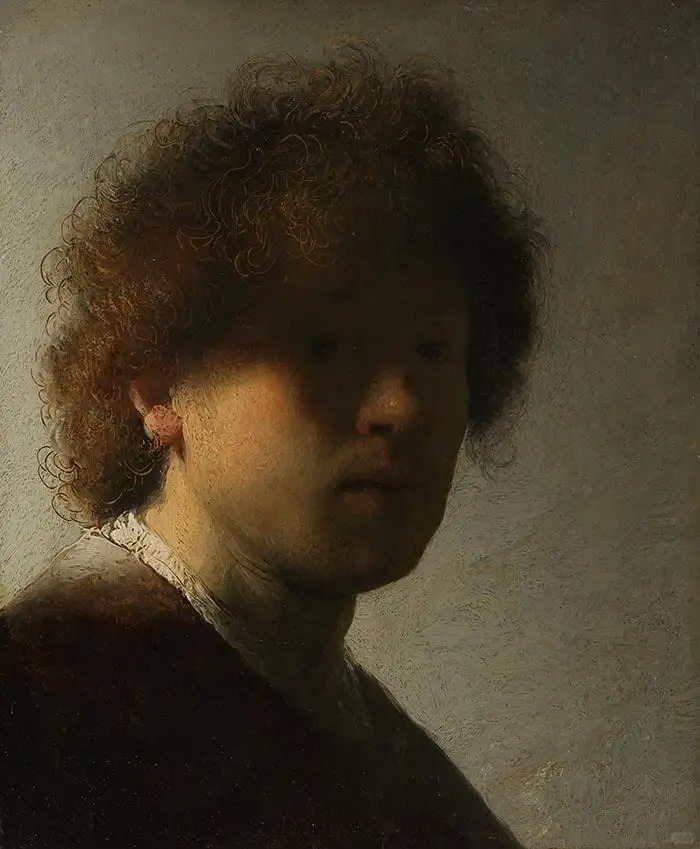
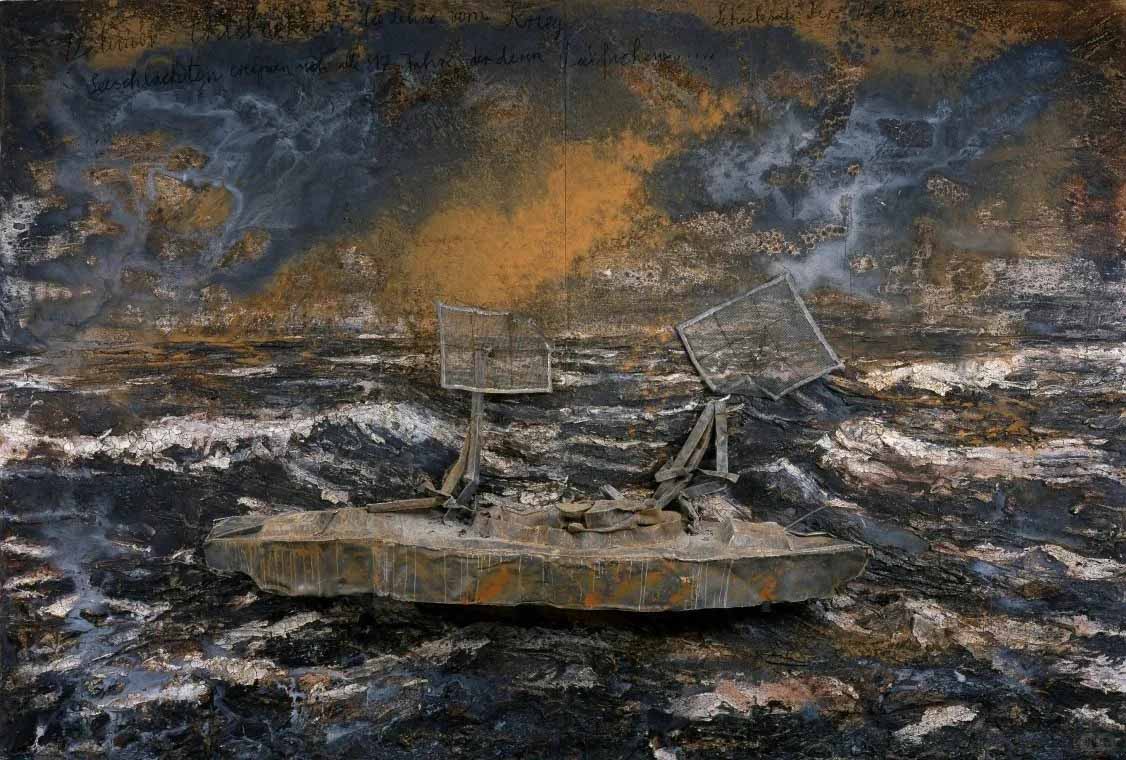
One of the most recognizable forms of contrast appears in differences between light and dark values. Value contrast creates dramatic visual depth and helps define the shapes of objects.
This technique reached a sophisticated level during the Baroque period through the use of chiaroscuro. Painters developed strong transitions between illuminated areas and deep shadows to produce emotional intensity.
Artists associated with dramatic lighting effects include Caravaggio, whose paintings demonstrate how light can isolate figures against dark environments. Through these contrasts, the narrative focus becomes unmistakable.
Value contrast also remains essential in photography, film, and digital art. Black-and-white imagery relies almost entirely on differences in light values to organize the composition.
Value contrast transforms light and shadow into a powerful tool for defining form, depth, and emotional atmosphere.
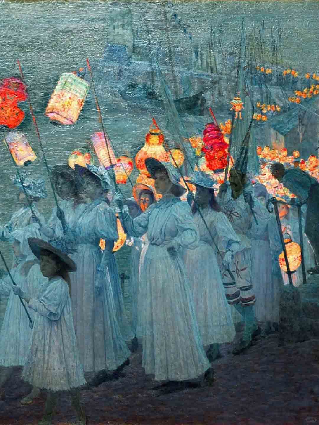
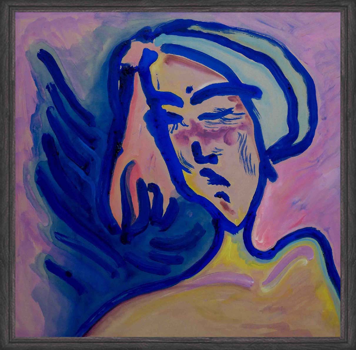
Color contrast occurs when hues differ strongly in temperature, intensity, or position on the color wheel. Complementary colors—such as red and green or blue and orange—produce some of the most visible forms of contrast in artistic composition.
In modern painting, color contrast became a central expressive tool. Artists of the Fauvist movement explored vibrant color relationships that departed from naturalistic representation.
A well-known example appears in the work of Henri Matisse, whose compositions combine saturated hues to create energetic visual balance. The juxtaposition of intense colors produces visual vibration and strong viewer attention.
Contemporary graphic design and digital illustration continue to rely on color contrast to maintain readability and visual clarity. Bright accents against neutral backgrounds create clear focal points.
Color contrast energizes visual perception by intensifying relationships between hues and directing attention across the composition.
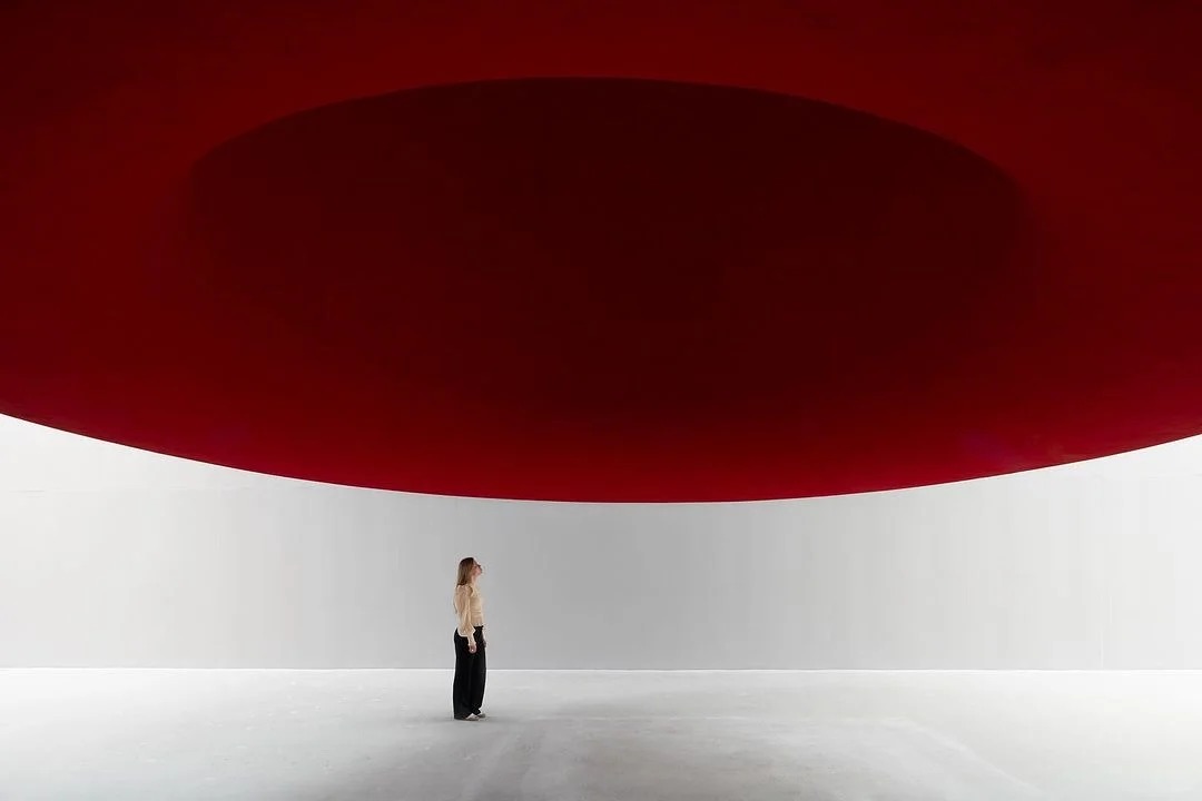
Another powerful form of contrast appears through differences in size. Scale contrast can make a small object appear delicate or a large object appear dominant. This relationship influences how viewers interpret importance within an artwork.
Artists frequently manipulate scale to challenge expectations. A miniature element surrounded by large empty space can appear fragile or isolated, while oversized objects create monumentality.
Modern installations presented in venues such as Tate Modern often employ dramatic scale contrast to reshape spatial perception.
Scale contrast establishes visual hierarchy by altering the perceived importance of elements within a composition.
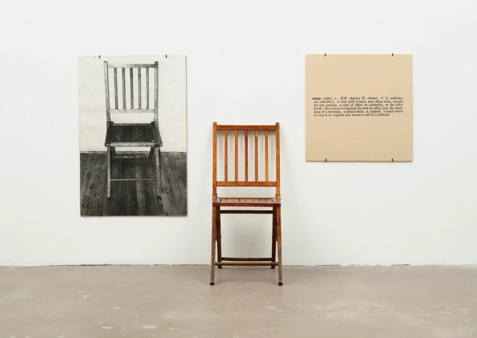
Texture contrast emerges when surfaces differ in tactile quality or visual appearance. Smooth and rough materials placed together introduce sensory variation that strengthens visual interest.
In sculpture and mixed-media art, artists combine materials such as polished metal, stone, fabric, and wood to create contrasting textures. The viewer becomes aware not only of form but also of material presence.
Architectural environments also rely on texture contrast. The interaction between glass, concrete, and natural materials produces visual complexity while maintaining structural coherence.
Texture contrast reveals the physical qualities of materials and deepens the sensory dimension of visual art.
Beyond visual elements, contemporary art frequently explores conceptual contrast. Artists place opposing ideas together to stimulate interpretation and reflection.
Conceptual contrasts may involve themes such as nature and technology, tradition and innovation, or order and randomness. These juxtapositions encourage viewers to interpret broader cultural meanings.
Conceptual contrast expands art contrast from visual structure into philosophical dialogue and cultural interpretation.
Contrast continues to play a central role in visual communication because human perception naturally detects difference before similarity. The eye instinctively moves toward areas where variation appears.
Artists therefore use contrast as a guiding mechanism. Through carefully balanced differences, they shape the viewer’s visual path across an artwork.
Art contrast remains essential because it converts visual differences into structure, meaning, and lasting aesthetic impact.
Hi, I’m Philo, a Chinese artist passionate about blending traditional Asian art with contemporary expressions. Through Artphiloso, my artist website, I share my journey and creations—from figurative painting and figure painting to floral oil painting and painting on landscape. You'll also find ideas for home decorating with paint and more.
For readers interested in experiencing these principles within contemporary artworks, the collection presented on artphiloso.com offers an engaging perspective. The works featured on the platform explore relationships between light, form, and atmospheric contrast through refined visual compositions.
Many of the pieces emphasize subtle tension between structure and fluidity, revealing how contrast can operate not only through color or brightness but also through rhythm, texture, and spatial balance. These artworks demonstrate how classical artistic principles continue to evolve within modern visual language.
Visitors to artphiloso.com can explore a carefully curated selection of works that reflect the enduring influence of contrast in contemporary artistic practice.
What is the definition of contrast in art?
The definition of contrast in art refers to the intentional placement of opposing visual elements—such as light and dark, large and small, or rough and smooth—to emphasize differences and guide viewer perception.
What does compare and contrast mean in visual analysis?
In art analysis, compare and contrast describes the process of identifying similarities and differences between visual elements in order to understand composition and meaning.
Why is contrast important in the principles of art?
Contrast is one of the central principles of art because it creates emphasis, organizes visual hierarchy, and helps viewers recognize focal points within a composition.
What types of contrast appear most often in artworks?
Common types include value contrast, color contrast, scale contrast, texture contrast, and conceptual contrast, each contributing different visual or interpretive effects.
How does contrast influence the viewer’s experience?
Contrast directs the viewer’s eye, strengthens emotional impact, and clarifies relationships between elements, allowing the artwork’s structure and meaning to become more perceptible.