Color is the core vocabulary of abstract painting. Without representational imagery, colors become the primary means of expression, emotion, and structure. Every brushstroke communicates through hue, value, and saturation. The interaction between colors—how they blend, contrast, or vibrate beside one another—defines the energy and rhythm of a work.
In abstract painting, color does not illustrate objects; it expresses feeling. Artists use combinations of warm and cool tones, muted and vivid hues, transparent and opaque layers to construct visual tension and harmony. Each choice contributes to how a viewer perceives balance, chaos, calm, or intensity.
Unlike representational art, where color often imitates nature, abstract color choices rely on intuition and perception. They invite the viewer to feel rather than to recognize. This liberation allows for endless experimentation and personal expression.
Color is the emotional architecture of abstract art—its structure is built through contrasts, harmonies, and intuitive relationships.
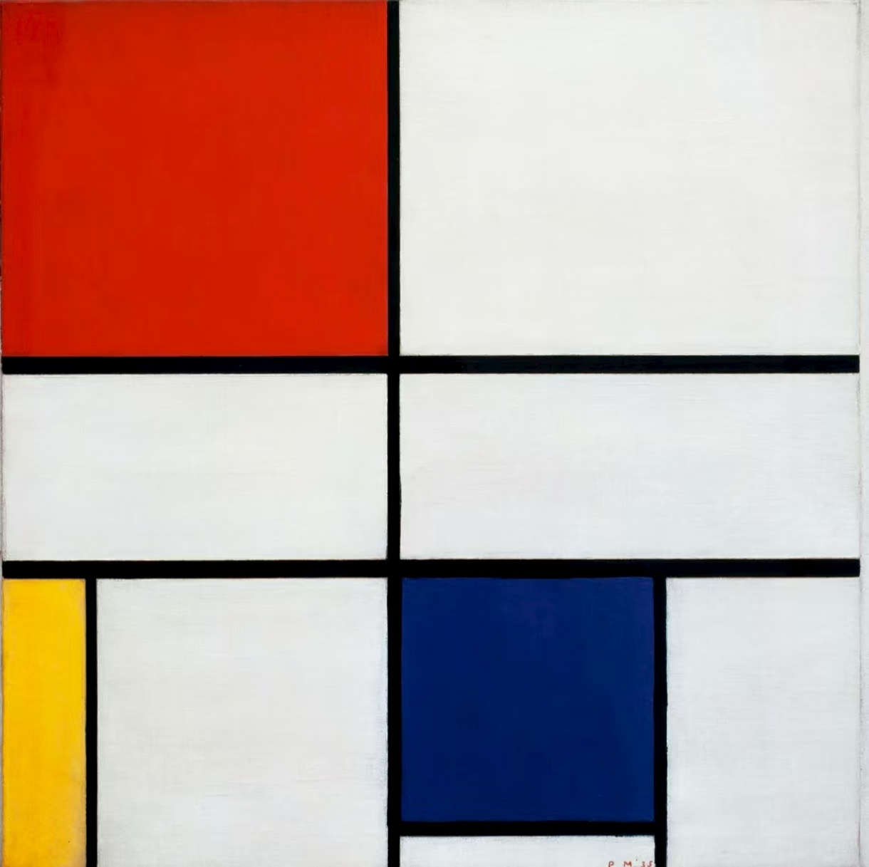
To control emotion through color, it helps to understand its structure. The color wheel remains a timeless tool for organizing hues and predicting their interactions.
Color harmony arises when hues relate in predictable and pleasing ways. Three classic approaches dominate color planning:
Understanding these principles helps artists make conscious choices before adding instinct and experimentation.
A solid grasp of color theory provides the scaffolding that supports creative intuition.
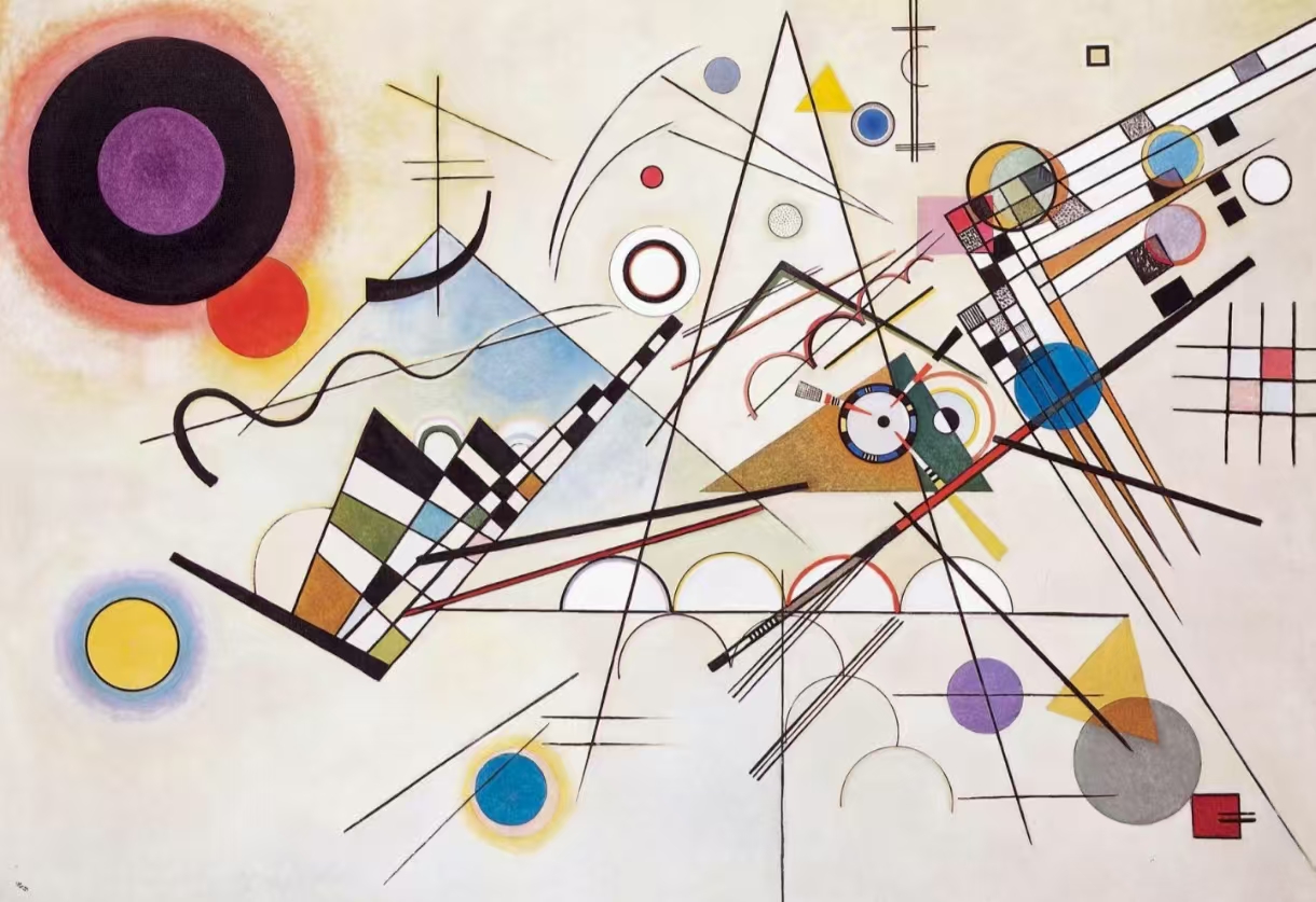
Every color carries a temperature. Warm colors—reds, oranges, and yellows—tend to feel energetic, intimate, or radiant. Cool colors—blues, greens, and violets—convey calmness, openness, and reflection.
In abstract compositions, the balance between warm and cool determines the overall mood. A predominantly warm palette may suggest passion or chaos, while a cool palette might evoke serenity or distance. The interplay between the two introduces emotional complexity.
Consider a canvas dominated by deep ultramarine blues contrasted by sharp streaks of crimson. The viewer senses both tranquility and intensity, a conversation between peace and tension. Warm tones push forward visually, while cool tones recede, adding depth to flat surfaces.
This spatial illusion is crucial for abstract work that lacks traditional perspective. Strategic temperature contrast directs attention and establishes rhythm.
Balancing warm and cool colors allows abstract painters to orchestrate emotional depth and visual movement.
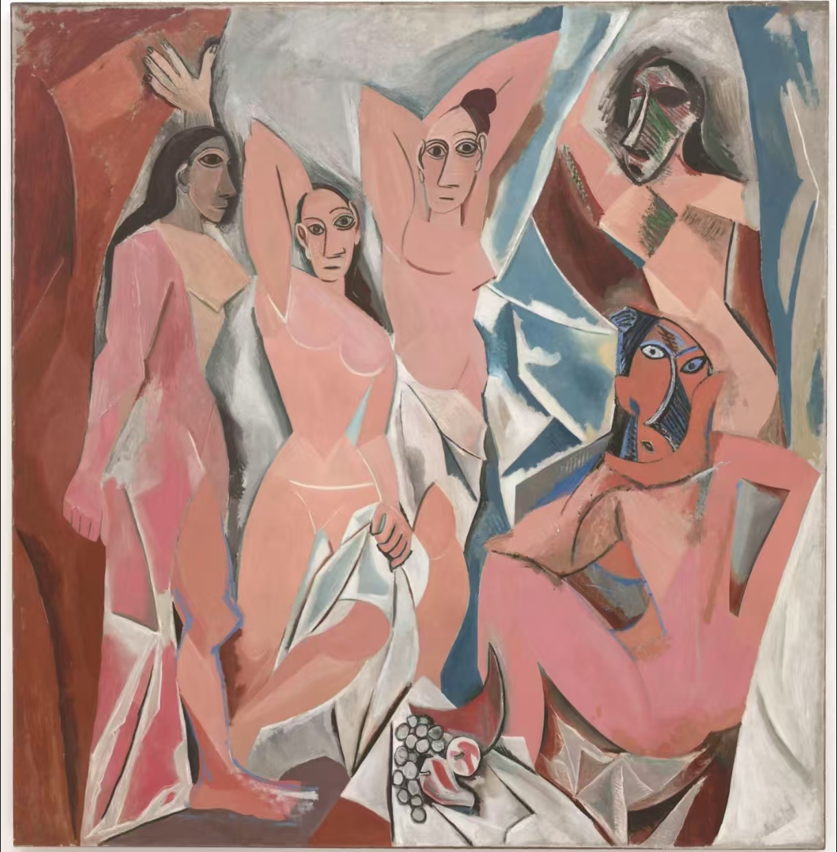
Value—the lightness or darkness of a color—defines structure in the absence of form. Even without distinct shapes, varying values can imply space, light, and rhythm. A painting with only mid-tone colors often feels static, while one with strong light and dark contrasts feels dynamic and dimensional.
Saturation adds another layer of control. High saturation creates intensity and immediacy; desaturation introduces subtlety and atmosphere. Many contemporary abstract artists use restrained saturation to evoke mood rather than spectacle.
Combining variations in value and saturation keeps even minimal color palettes engaging. It also helps guide the eye across the canvas, creating focal points and moments of rest.
Mastery of value and saturation transforms simple colors into complex spatial and emotional experiences.
Color operates as both a visual and psychological phenomenon. Studies in color psychology show that humans associate colors with instinctive emotional responses.
Abstract painters can exploit these associations to shape viewer emotion intentionally. However, perception also depends on cultural background, lighting, and surrounding hues. For instance, a deep blue may appear soothing beside white but melancholic beside gray.
Understanding how context alters perception allows artists to use color not as a fixed symbol, but as a living, shifting energy.
Psychological awareness helps artists use color to influence not just sight, but feeling and memory.
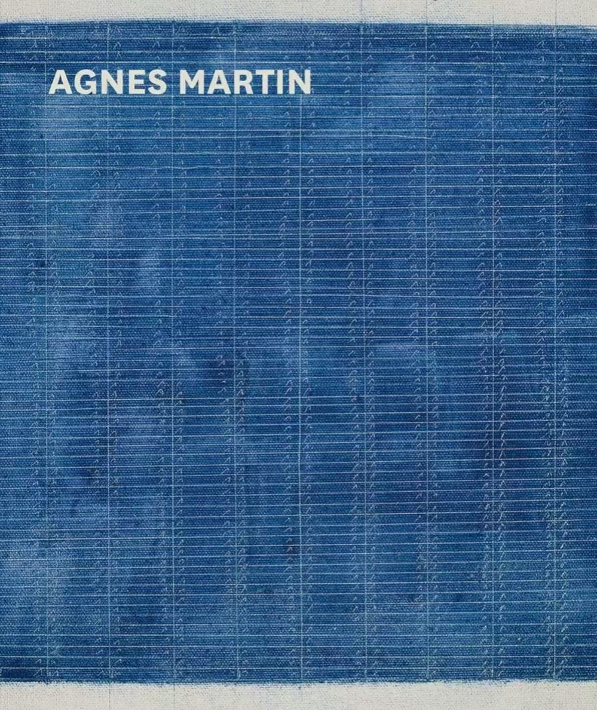
In abstract painting, texture transforms color from a flat pigment into a physical presence. Layers of paint—thin washes, thick impasto, translucent glazes—create variations in how light interacts with the surface.
Layering allows artists to build visual depth. A transparent wash of blue over a textured white base produces shimmering optical vibration. A scraped layer of green over dry yellow adds tactile energy. Through layering, artists control not only hue but also light absorption and reflection.
Texture also affects emotional tone. Smooth gradients feel meditative, while rough, irregular textures suggest chaos or tension. Contemporary painters referenced at major events like Art Basel Miami Beach and Frieze New York use layered color fields to explore both visual and tactile sensations simultaneously.
Texture transforms color from a visual element into a physical and emotional experience.
Harmony in abstract art is not just about choosing matching colors; it’s about managing contrast and rhythm. Contrasting colors create tension; repeated hues and balanced spacing create resolution.
Large bold blocks of blue next to thin red lines generate visual rhythm, while open white spaces allow the eye to rest. The dialogue between saturation and silence—color and emptiness—builds the painting’s pulse.
Even asymmetrical compositions achieve balance when visual weight is distributed intentionally. A dense corner of vibrant purple can be offset by an open field of muted beige. These relationships between color masses define the artwork’s equilibrium.
Harmony emerges not from similarity but from intentional contrast and controlled rhythm.
While color perception is partly universal, its symbolism changes across cultures. Western traditions often link white to purity and black to mourning, whereas in parts of Asia, white may symbolize death and red prosperity.
Abstract painters working in a global context often explore how these associations shift meaning—such as through exhibitions at major biennials. Using green and blue may suggest nature and renewal to one audience, but modernity and technology to another.
Acknowledging these cultural readings adds richness and complexity to abstract compositions. It reminds artists that color exists not only in the eye but also in history, ritual, and shared memory.
Color carries both personal emotion and cultural memory, deepening the interpretive layers of abstract art.
Every abstract painter eventually discovers a personal color language. Some artists gravitate toward luminous cool tones; others explore the tension of saturated primaries. Developing a palette is an ongoing process of discovery, guided by emotion, experience, and observation.
Begin with limitation. Select a few hues that feel authentic, and explore their variations in value, texture, and proportion. Observe how different lighting conditions or media alter perception. Over time, consistent experimentation shapes a signature visual voice.
Many contemporary painters document their evolving palettes in sketchbooks or digital swatches, much like photographers adjusting exposure settings. This reflective practice sharpens sensitivity to subtle relationships and long-term consistency.
A personal palette is an artist’s emotional fingerprint, refined through consistent experimentation and reflection.
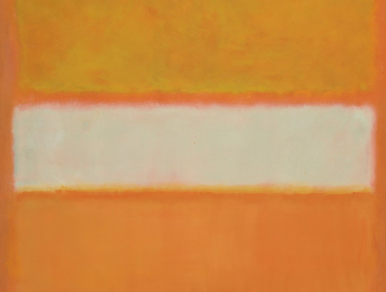
Bringing theory into practice requires both structure and spontaneity. Planning helps establish direction, but intuition breathes life into abstraction.
A practical workflow might include:
Throughout this process, allow flexibility. Abstract art thrives on accidents: a misplaced stroke or unexpected mixture can open new directions.
True color harmony arises when technical knowledge meets fearless experimentation.
Contemporary artists often merge traditional painting methods with digital experimentation. Software like Adobe Fresco, Procreate, and Corel Painter enables color testing before committing to physical canvas. These tools expand creative range and reduce material waste.
Digital layering mimics physical techniques such as glazing or impasto but allows instant adjustment. Color blending algorithms also reveal surprising harmonies and tensions that inspire later studio work.
However, the digital realm should complement, not replace, tactile engagement. The sensory feedback of real paint—its resistance, texture, and unpredictability—remains essential to understanding how colors behave in reality.
Blending digital exploration with physical practice enhances precision without sacrificing authenticity.
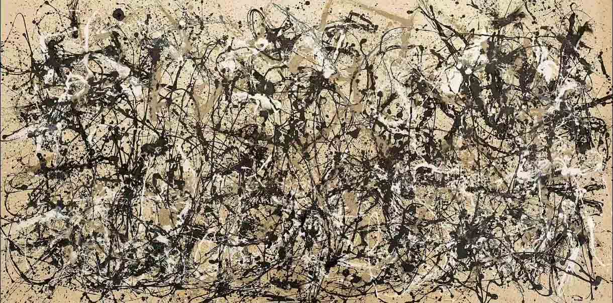
Today’s art landscape values both innovation and authenticity. Exhibitions at institutions such as The Museum of Modern Art (MoMA) reveal the diverse ways contemporary artists use color to express social, psychological, or environmental narratives.
Some focus on chromatic minimalism—fields of subtle tone variation. Others embrace high-contrast palettes referencing pop culture, digital screens, or urban graffiti. This diversity reflects color’s enduring relevance as both aesthetic and conceptual material.
Abstract painters today work across mediums—acrylic, oil, mixed media, installation—each affecting color differently. Acrylics dry fast and allow layering; oils blend slowly, encouraging depth and nuance. The choice of medium shapes the life of each hue on the surface.
In the contemporary art world, color remains the most versatile and immediate bridge between concept and emotion.
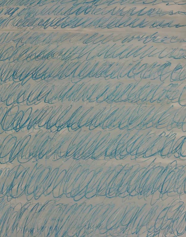
The art of painting abstract colors is a continuous dialogue between knowledge and instinct. Each hue carries history, emotion, and material behavior. Artists who master color theory but remain open to surprise create works that resonate both visually and emotionally.
Understanding relationships between hue, value, temperature, and saturation allows greater control. Yet the real power lies in letting colors breathe, collide, and evolve organically.
Harmony in abstract art is not a fixed formula—it is an evolving relationship between perception, emotion, and exploration.
This article has built on the foundation of previous guides and expanded into texture, culture, technology, and personal vision, offering a more comprehensive roadmap for contemporary abstract painting.
Hi, I’m Philo, a Chinese artist passionate about blending traditional Asian art with contemporary expressions. Through Artphiloso, my artist website, I share my journey and creations—from figurative painting and figure painting to floral oil painting and painting on landscape. You'll also find ideas for home decorating with paint and more.
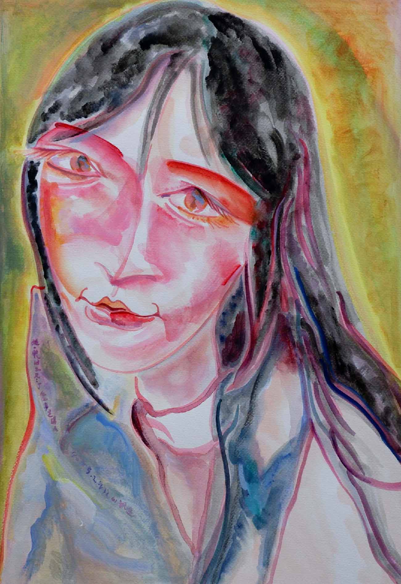
She saw all the seductive swaying in love at one glance 1
Acrylic Painting
Date: 2025
by Philo
View Product
How do I choose a starting palette for abstract painting? Begin with three to five colors that evoke your desired mood. Explore their variations in value and transparency before expanding. Limiting your palette builds confidence and coherence.
What is the role of neutral tones in abstract design? Neutrals such as gray, beige, and off-white provide visual breathing space. They allow vibrant hues to stand out and help maintain balance in a dynamic composition.
How does texture affect color perception? Texture changes how light interacts with pigment. Smooth areas reflect evenly; rough textures scatter light, creating visual vibration and emotional nuance that simple color alone cannot convey.
Are complementary colors always effective together? Complementary pairs like red/green or blue/orange create strong energy. But used incorrectly they can dominate or clash. It’s more effective to use one as dominant and the other as accent, retaining harmony.
What’s the difference between visual harmony and emotional harmony? Visual harmony relies on balanced contrast, proportion, and rhythm. Emotional harmony depends on how color combinations make the viewer feel—calm, excited, nostalgic, or thoughtful.
Can digital tools replace physical color mixing? Digital programs are excellent for testing combinations quickly. But physical mixing reveals texture, opacity, and pigment behavior that digital cannot fully replicate. Both are useful.
How can cultural meanings influence my color choice? Different cultures interpret colors differently—white may mean purity in some, mourning in others. Being aware of these variations adds interpretive depth and helps avoid unintended symbolism.
How important is intuition in selecting colors? Technical knowledge provides structure, but intuition brings authenticity. Your best abstract color work comes from letting knowledge support freedom and following your responses to color.
What’s the simplest way to improve color harmony in abstract art? Observe the world: nature, design, digital media. Notice how colors interact under different light and context. Practice translating those observations into your own compositions.
Why does color harmony matter in abstract painting? Because in abstraction, color becomes the language. When hues connect with intention and emotion, they engage not just sight but memory and feeling—making the painting more than decoration.
