How to Match Wall Art with Home Decor: A Step-by-Step Guide
There is a wall at home, how to hang paintings to make it look good? After analyzing a large number of design cases and practical experience, I have summarized the matching skills of who uses whom, and take you to see the aesthetic logic behind the paintings.
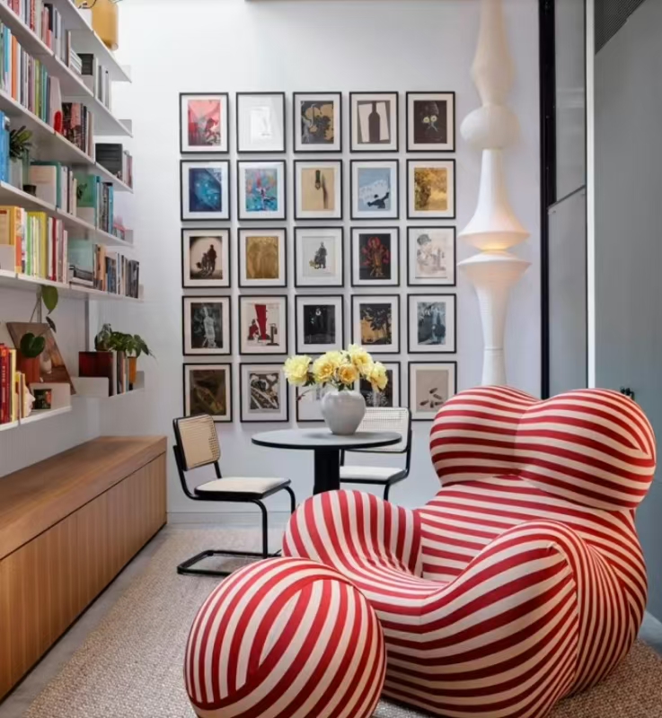
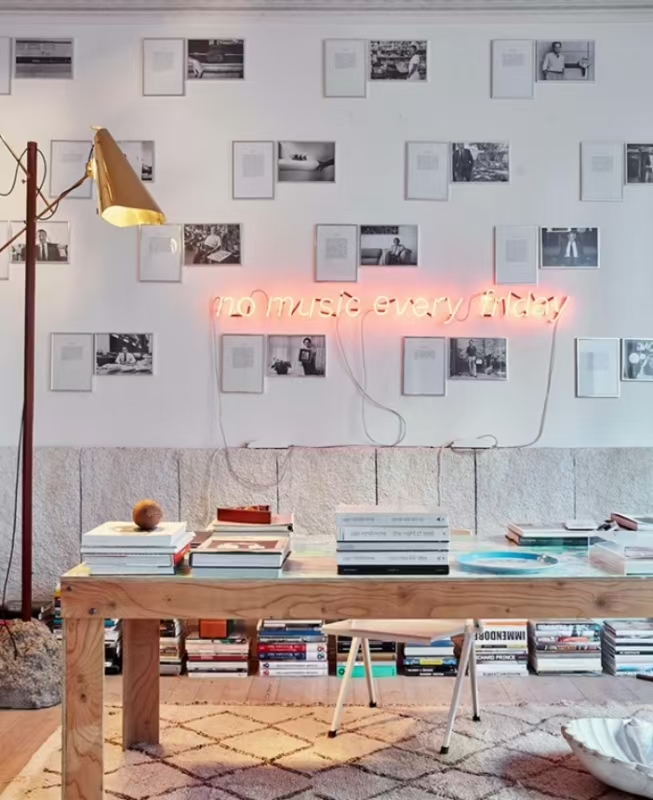
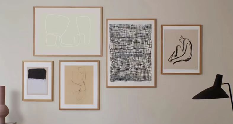
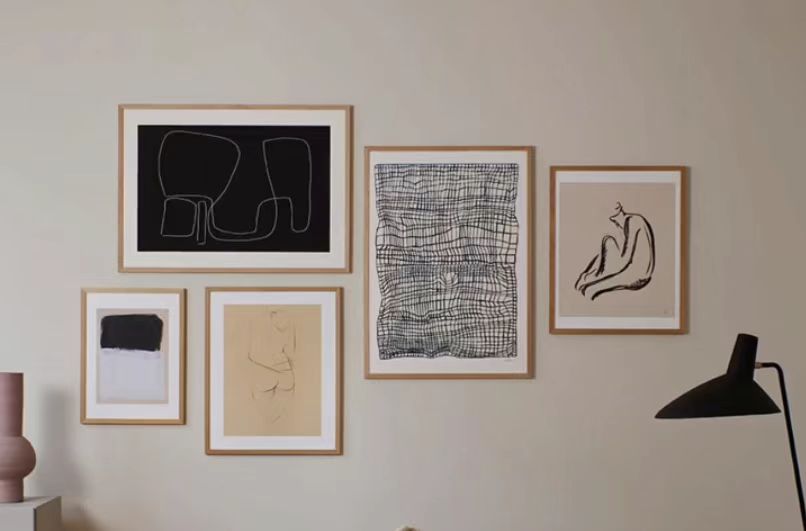
Step 1: Choose the Right Layout Style Grid layout
This is relatively simple, that is, hanging side by side at the same height, with the same frame size. If it is a series of works, this symmetrical layout will be more advanced.
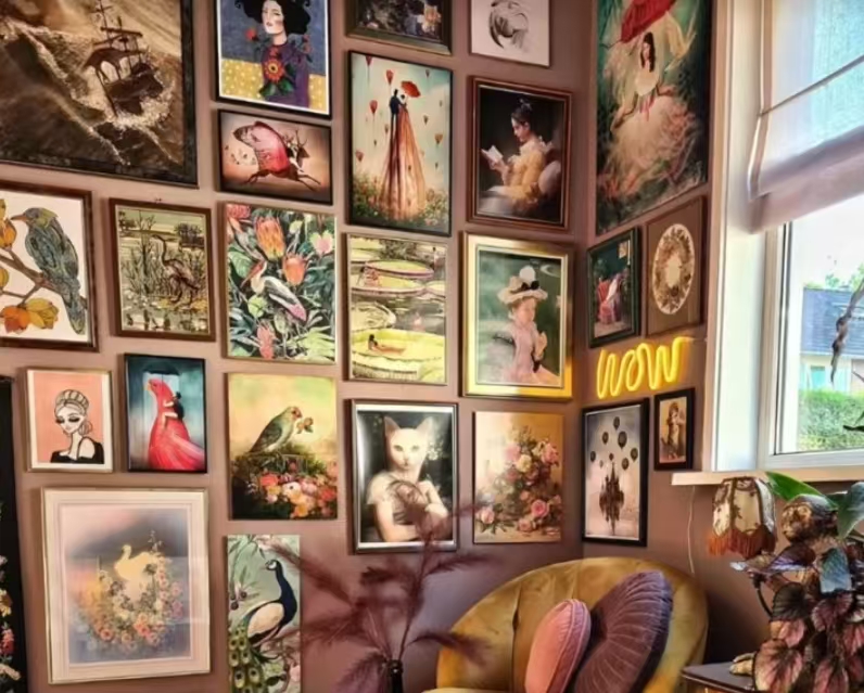
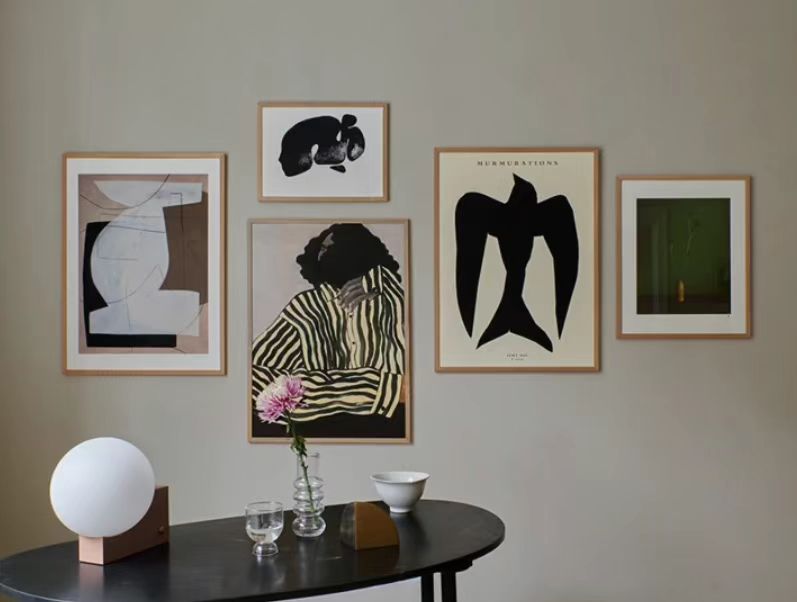
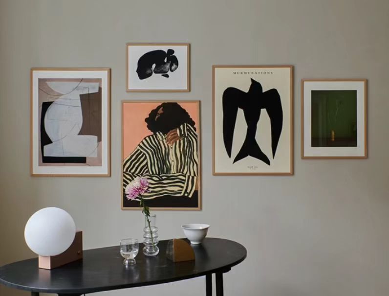
Free Combination Layout
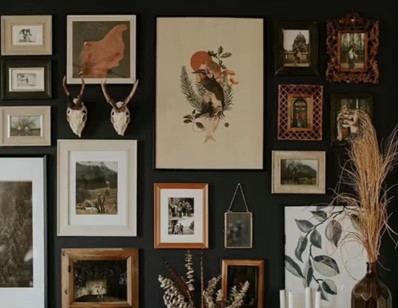
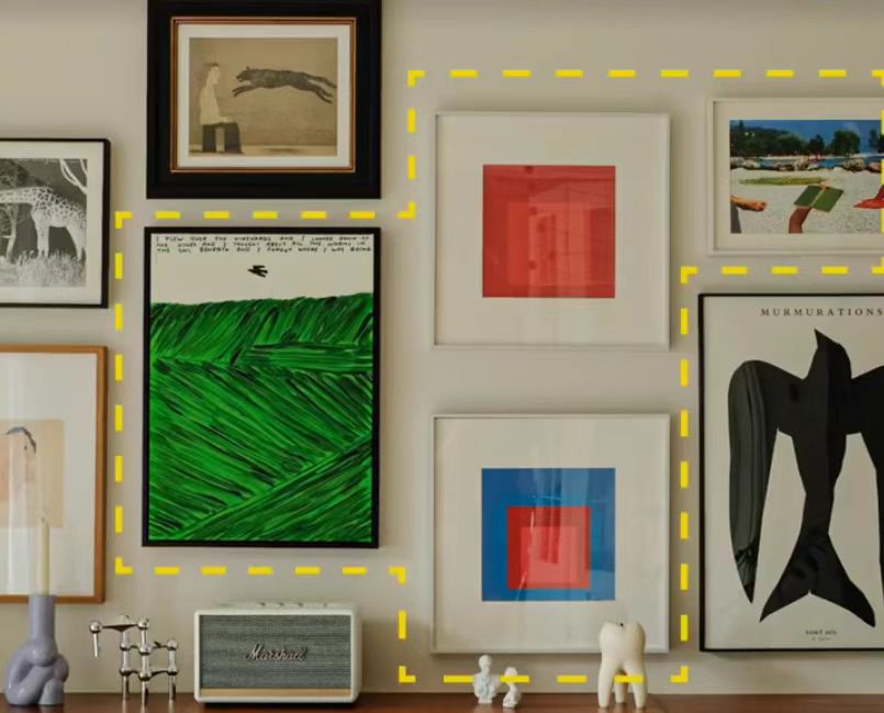
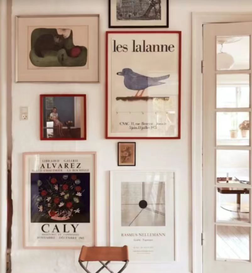
For a more expressive and personalized style, try an asymmetrical arrangement. The key is visual contrast and layering.The key to this approach is adding visual depth by playing with contrast. Here are four key dimensions of contrast:
1.Complexity and simplicity
This wall is full of many figurative pictures, which makes people breathless. Let's look at this picture again. The figurative and realistic pictures are matched with simple and abstract patterns. There is a focus at once, and it is naturally much more comfortable.
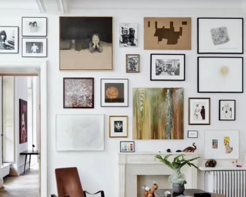
2.Size and proportion
The paintings of large and small sizes will make the whole wall look more tense. Proportion refers to the proportion of the picture. For example, a full-frame painting with a blank painting will have a more breathable feeling.
3.Shape and material
Occasionally adding a special shape to a square frame will make it more lively. Mixing decorations of other materials can enhance the fun of the wall. You can give full play to your creativity.
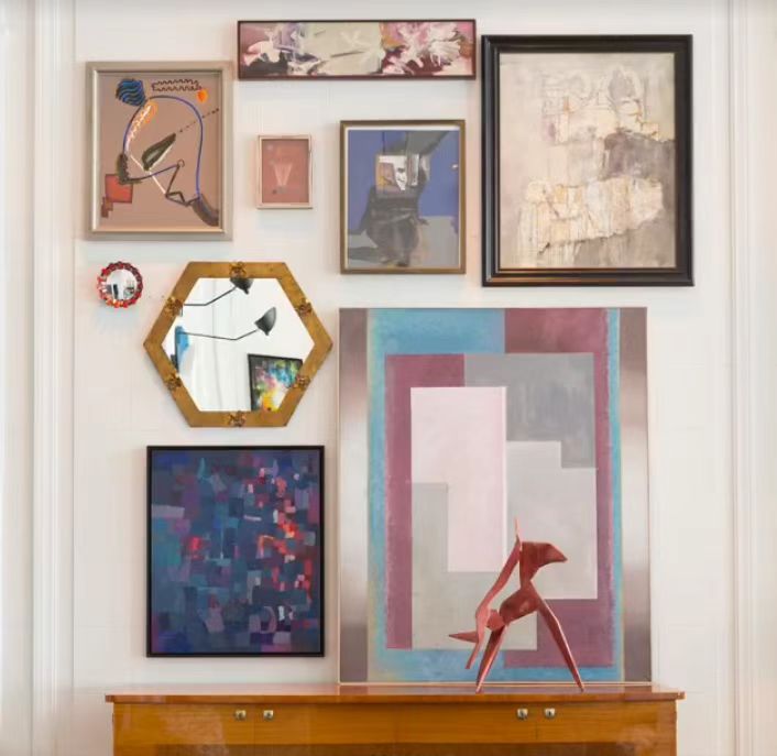
4.Picture frame combination
Don't ignore the importance of the picture frame. The combination of thick and thin frames, the combination of wooden frames and metal mines, the combination of framed and frameless frames, and even empty frames can be used to play a lot of tricks. You can also use the color of the picture frame to make the whole wall more personalized.These contrasts work together to create visual interest and a curated, intentional atmosphere.
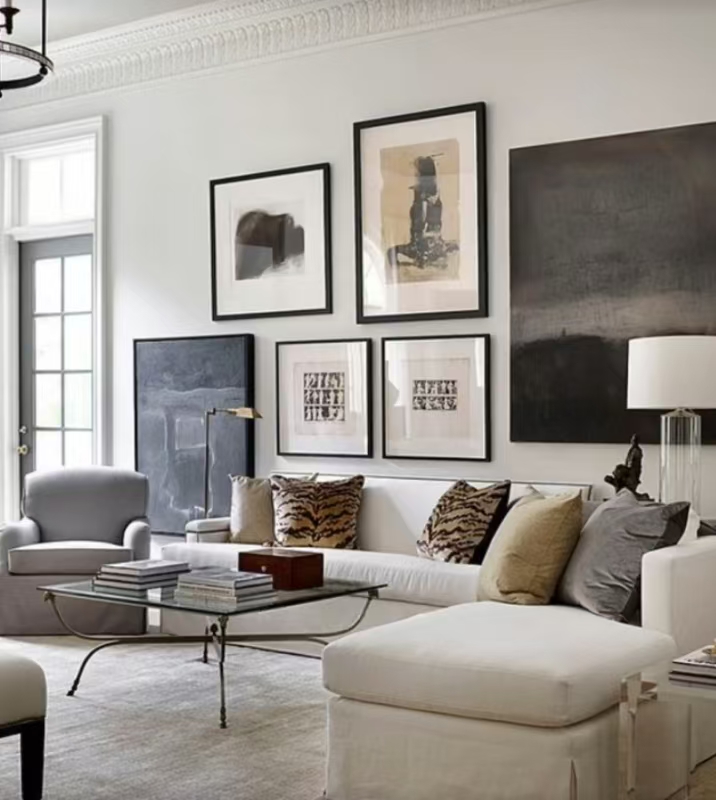
Step 2: Create Color Harmony
When there are already many paintings with high color saturation or light colors, which appear to be light and fluttering, matching with paintings with larger blocks of darker colors can play a role in visual balance. On the contrary, if the overall color is darker or plainer, adding a very eye-catching color to the painting will make it stand out.
Final Tip:
Before hanging anything, try placing your framed works on the floor to experiment with the layout. Take a picture, step back, and assess how each piece interacts. Art isn’t just for decoration — it tells your story, piece by piece.